Hi Graphic Content Readers!
Rafael Albuquerque here! Pamela Mullin asked me to talk about the creative process for AMERICAN VAMPIRE #2 cover!
So... The main ideas for the cover concept of AMERICAN VAMPIRE are:
-Presenting the characters in a mysterious way
-Reiterate the format of the book, which brings together two tied-in stories.
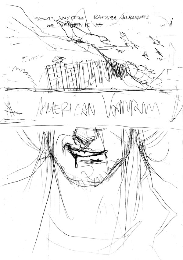
Following this little briefing, I decided to use our anti-hero Skinner Sweet on this cover, using an old west hat (that was the easiest part, 'cause we've already used Pearl Jones on the #1) on the bottom. The top, however, was way trickier.
 The idea was creating an image that could remind the Hollywood glamour and also death, so my first thought was showing part of the famous sign, and some ravens over it (see image attached).
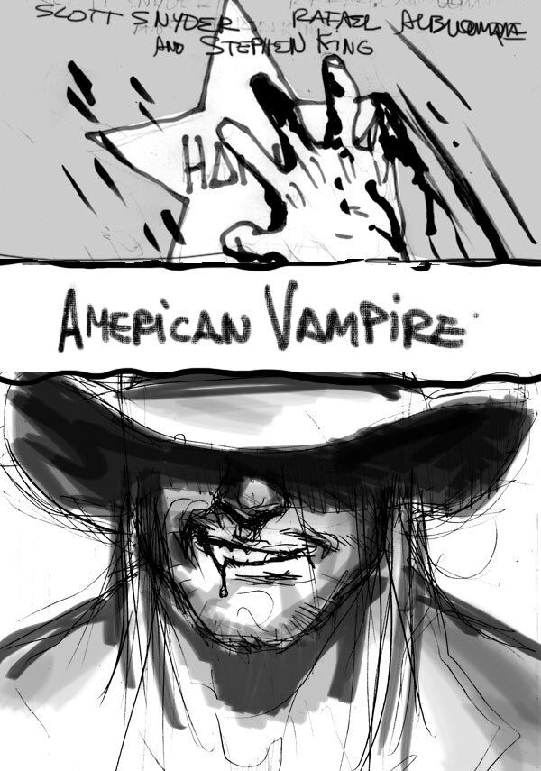
 The editors thought that we needed something more directly related to the story core, so after some try-outs, I came up with the idea of a bloody hand opening a dressing room door.
The editors liked it! YEAH!
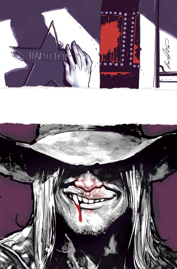
 The main color took a little time to be chosen. I tried versions of purple:
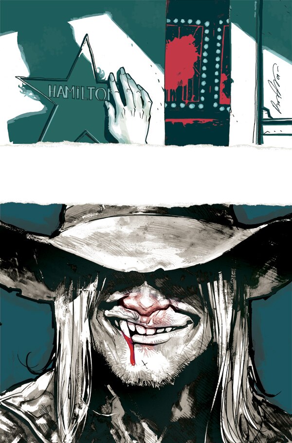
 And green (green one was actually approved by everybody):
 But after a visit from Gabriel Bá (Daytripper), he suggested a darker color. A beautiful and desaturated kind of blue. It killed any doubts we had about colors. (Valeu Bá!)
 Really hope everybody enjoys this one. It's my personal favorite so far! I’ve got to go now and think about the next covers and draw some pages before Mark Doyle kicks my ass out of the book!
Cheers!!
Rafael.

Editorial
Rafael Albuquerque reveals AMERICAN VAMPIRE Cover 2
BY: DCE Editorial
Thursday, January 14th, 2010


